Are you considering an Apartment Makeover?
Doing an apartment makeover doesn’t have to be expensive and from years of experience in the apartment renovation industry, I have a wealth of knowledge that I’m only too happy to pass on. Whether your apartment is large or small each offers unique challenges.
However, it’s surprising what can be achieved using a combination of paint colours and furnishings to create a homely and cosy apartment
To start the process, read magazines, visit bathroom and kitchen showrooms, start a scrap book to fill with inspirational clips, and browse websites as there are so many ideas out there.


Then, when we do sit down together to discuss your likes and dislikes, we can build on the excitement of taking the first steps to starting your renovation. As far as products go, it’s surprising what is out there. New products are always coming onto the market to inspire your creative bent.
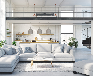
A tip; if your apartment is small, a suggestion is to paint the walls all the same colour – preferably white.
If you have ornate cornice and moldings, make them disappear. Outlining them can make the rooms feel smaller. Then,using a unified colour palette of furnishings, textiles, and light fixtures: you can anchor each room with a large statement piece. The bedroom can be an upholstered bed, the living room, a large sofa and two smaller cocktail tables. It all adds to the flexibility and interest.
If you have the luxury of a larger apartment, than you can make fashion statements with lots of layers, character-rich vintage pieces, and a few flamboyant colours. Like the project we recently completed in the salubrious Elan in Kingscross Road.
The entry way was clad in a darkly rich veneer with subdued pelmet lighting to soften the entrance. The living room wall featured using a dark charcoal colour accent and artwork, with ever so slightly grey colours used on the other walls in combination with large floor tiles to create a subdued relaxed ambience.
In the hallway, the client, again using the dramatic charcoal colour, provided an additional frame to enhance and reinforced the dark blues that were contained within the art work.
A designer secret- if you do hang artwork and place floor mats, vary the widths of the picture frames and floor mats to add life and make the groupings more dynamic.


